Our name
"Breww" is spelled with a capital B and all other letters lowercase. Although the logo uses a fully uppercase version, it must in all other places always be written as "Breww".
Our website is at "breww.com". Please always write this as just "breww.com" (not variants such as "www.breww.com").
Our logo
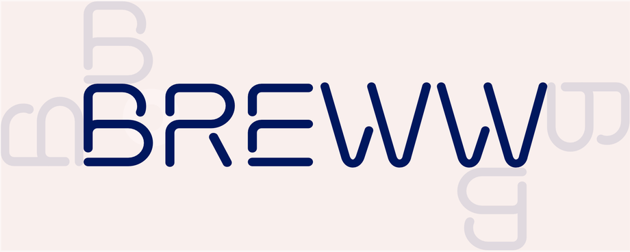
Our marque features rounded lines that represent the flow of the brewing process. These lines weave together effortlessly — just like how our systems simplify operations for customers. It's minimal, distinctive and something we're incredibly proud of.
Our marque is our first point of recognisability for our brand, so we must use it correctly in every instance.
Leave space around the logo
It's important to leave plenty of space around the logo, so that it doesn't get lost in the background. To help, we've identified easy-to-apply exclusion zones to allow our marque to breathe. The only exception is with straplines, which may sit halfway into the lower exclusion zone.
Please note: always use the "B" at the size of your logo to determine the exclusion zones.
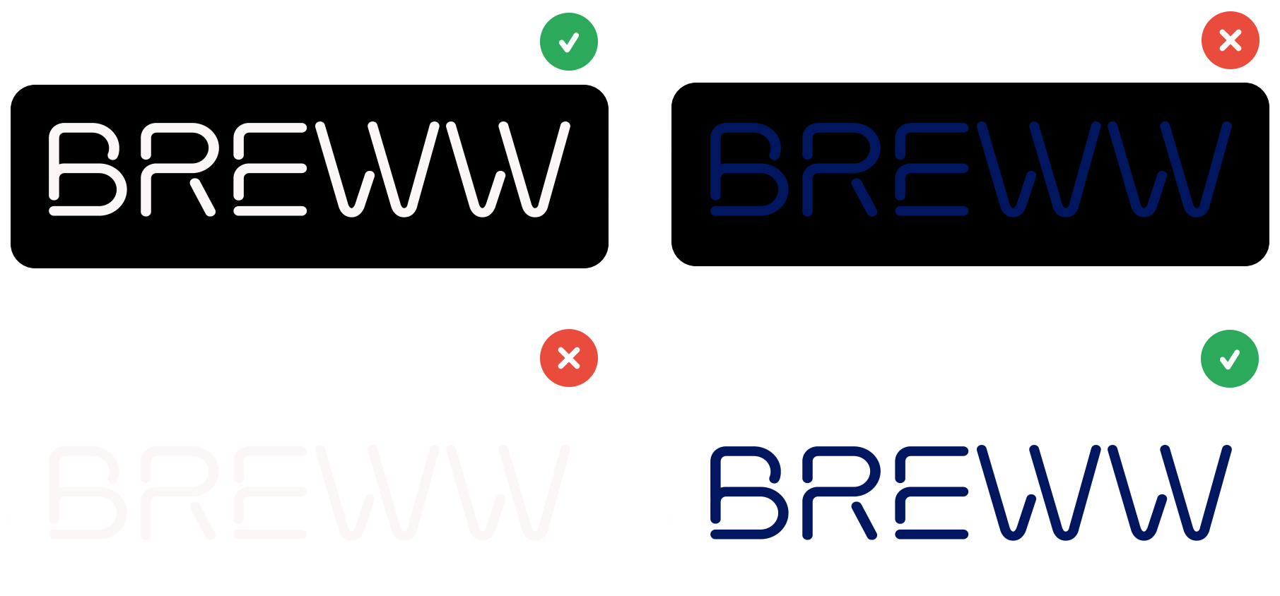
Choose the right logo for the background
When placing our logo on a dark background, use the reverse version which we designed specifically for this type of application.
Don't change the logo
We have this beautiful marque that represents who we are, so please don't change it in any way.
To help, we've created a few rules around how we use our logo, here are some examples of things not to do.

Please don't change the angle.

Please don't deviate from the assigned colours.

Please don't stretch.

Please don't squeeze.

Please don't add any effects.
Please don't make the logo illegible.
In most cases our logo will be provided as a pre-designed linkable asset which shouldn't be altered in any way, as shown below.
Download our logo pack
To use our logo, download the logo pack here. Do not modify the logos in any way.
Download logo pack