Prijzen Contact Aanmelden Boek een demo Aan de slag
Merkactiva

Using the Breww brand.

Thanks for your interest in Breww. A few guidelines before you use the logo, then the pack is yours.

Onze naam

Breww, one capital B

Capital B, everything else lowercase. The logo uses uppercase, but written down it is always "Breww".

Our website is "breww.com". Not "www.breww.com", and not "Breww.com".

Our marque

Rounded lines, on purpose

The marque's lines represent the flow of the brewing process, weaving together the way Breww pulls a brewery's separate jobs into one. It is the first thing people recognise us by, so it needs to appear correctly every time.

The rules, in three

1. Leave it room to breathe

Use the width of the "B" at your logo's size to set the exclusion zone on all four sides. Straplines may sit halfway into the lower zone.

Logo-uitsluitingszones

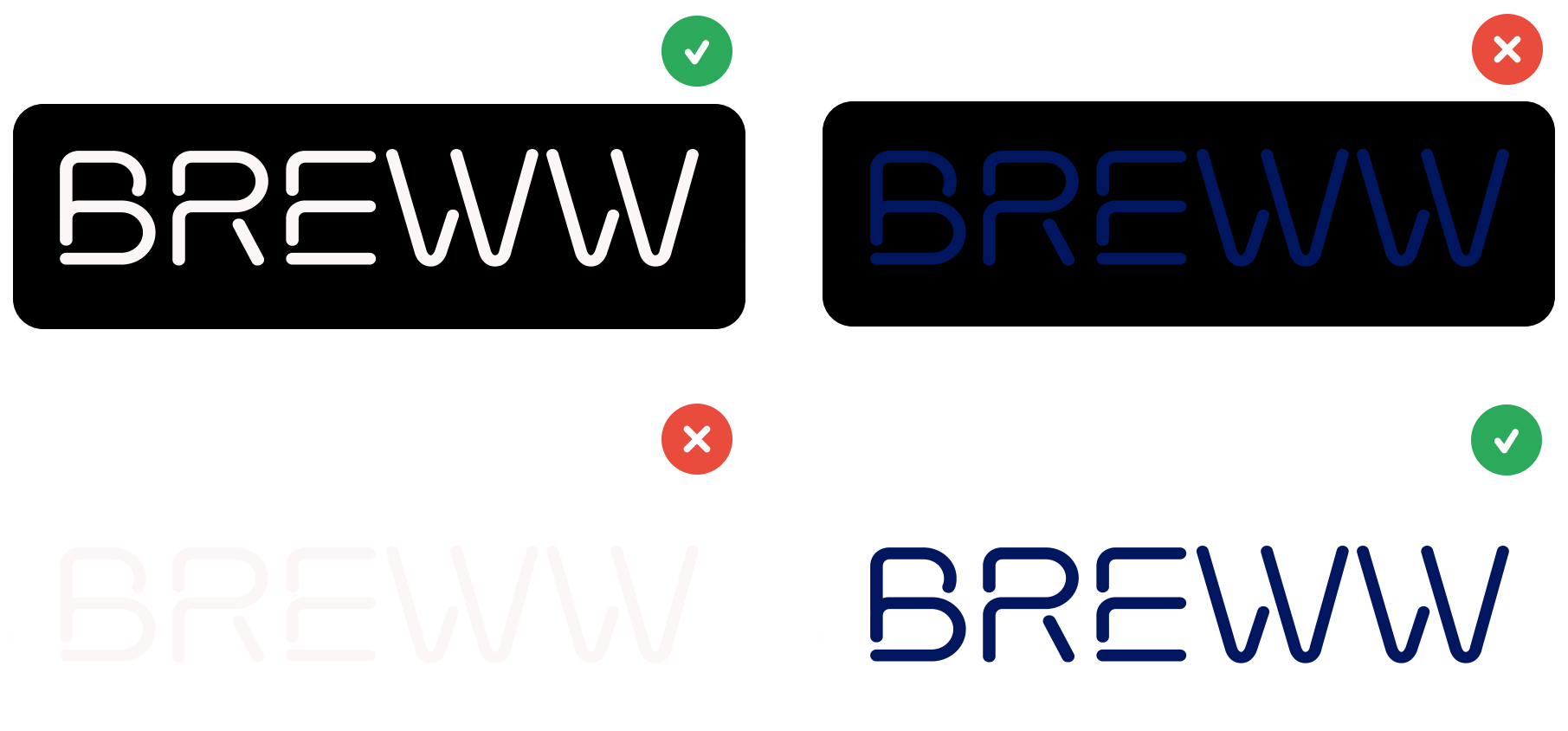
2. Match the logo to the background

On anything dark, use the reverse version. It exists for exactly that, so please do not recolour the standard one.

Logo on light and dark backgrounds

3. Do not change it

No rotating, recolouring, stretching, squeezing or effects, and never at a size where it stops being legible.

No rotating
No other colours
No stretching
No squeezing
No effects
Never illegible

Boek een demo

Tell us where you are based so we can match you with the right person.

Loading...